What is Colour Psychology and how does it work?
Colour psychology centres around the fascinating ability colour has to speak to us on a conscious and also subconscious level. Colour can instinctively conjure an emotional response as light receptors in the human eye transmit messages to the brain.
Colour is absolutely everywhere and is undeniable as a major component of our daily visual intake. So much so, that we can sometimes begin to fail to notice the impact colour has on us on a conscious level.
Colour speaks to us
Even if this is happening, subconsciously colour is still speaking to us continuously whether we realise it or not.
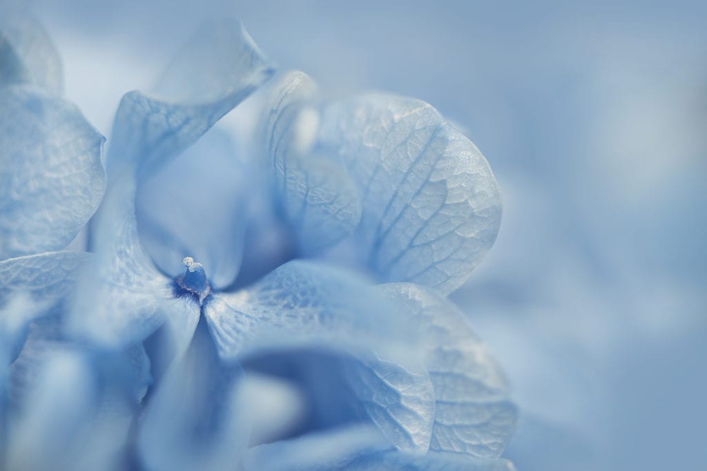
If we walk into a room with walls painted from floor to ceiling in bright red or orange, we will emotionally feel something very different to when we walk into a room with the walls painted in a shade of soft blue. We would go from possible agitation in the bright red or orange room, to calmness in the pale blue room.
Walking into a room painted bright red ororange, we may also experience a physiological reaction after our initial psychological response. Increased heart rate, rapid breathing, increased blood pressure.
We may get sweaty and feel the need to remove ourselves from a seemingly threatening environment. On the other end of the spectrum, when we walk into a room painted in a soft blue, our heart rate and breathing may slow, we will feel calm.
We will feel safe and protected.

The psychology behind colour is well documented
There have been many studies on the function and psychology of varied colours, delving into the psychological and physiological impact of individual colours on our mood and emotions.
In 1666, Sir Isaac Newton gave us the first colour wheel when he showed us the seven individual colours in their different wavelengths beaming from a prism hit with white light.
In 1810, the first edition of Goethe’s Theory of Colours was released which outlines the effect of colour associations by means of which they act on the mind.
Stating how different colours and colour combinations produce a corresponding influence on the mind. Also exploring the thought that certain colours create certain states of emotion.
The use of colours
Today, colour psychology and colour emotion has been used extensively for many years in marketing, advertising, home interior design. And many other industries by artists, designers, even film makers creating movies on the big screen all with the aim of creating the opportunity for people to feel an intended emotion to reach them on an emotional level.
Across corporations you may notice a lot of financial, technology and health companies use the colour blue in their branding. Blue stands for authority, trust, security and reliability.
Blue also subconsciously, instinctively makes us feel safe, peaceful and calm.
Red conjures the strongest effects of any colour. The psychological effects of red can range from love, passion, excitement and energy through to the other end of the spectrum including danger, anger, aggression and dominance.
How the colour red reaches you psychologically depends on the shade and hue, how the colour has been used, and also your personality type. Red is one of the most contradictory colours we have, think red roses, through to a red stop sign.
The two main types
Fast, warm colours like red and yellow can have a physiological effect on you including accelerated blood pressure an increase in your breathing rate an increase your heart rate and also subsequentially, your hunger.
This is the reason why major food outlets will often have red, orange or yellow in their logos and branding.
Slow or cool colours as you would expect have the opposing physiological effects. A slowed heart rate slowed breathing rate lowered blood pressure.
Cool colours such as blue and green are not threatening and conservative allowing feelings of peace, tranquility and stability.
The focus
For me in my work with a focus on mental health, I was searching for a way to send a repeating, constant message to the minds of others. A message of safety, peace, unconditional love, calmness and strength.
A message that would be received many times a day and could be given to the intended person even when I wasn’t with them, and even if they were alone.
Using colour psychology in fine art photography was the solution to this search, I didn’t want to use words that had to be actively read. I wanted to use a universal language that would speak to us without us even trying or realising we were being spoken to. A language that would reach our subconscious without any effort required.
We often believe what we hear, whether it is good or bad. If we hear it often enough we believe it whether we are being put down or supported, we believe what is fed into our mind on a regular basis.
And as they say, we are what we eat, this applies to what we feed our body as well as what we feed our mind. We become who we believe we are to become, allowing ourselves to have what we believe we are worthy to receive.
If a single use of colour in the form of wall art of light pink for example when presented correctly and intentionally, has the power to speak to our conscious and subconscious mind and help make us feel unconditional love and kindness, every child, every adult could only benefit.
Thank you so much for being here,
The Humble Hunter x
Click here to see my Artwork Gallery for more colour psychology.
References:
Author: Johann, Wolfgang von Goethe (1810), Retrieved from
https://www.gutenberg.org/files/50572/50572-h/50572-h.htm
Author: Maria Popova, Retrieved from
https://www.brainpickings.org/2012/08/17/goethe-theory-of-colours/
Author: Unknown, Retrieved from
https://www.pantone.com/color-intelligence/articles/technical/how-do-we-see-color

