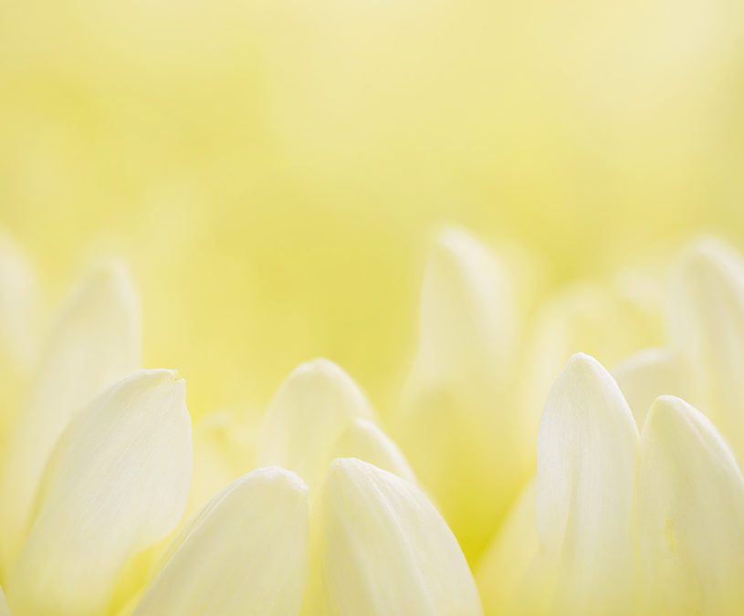
Wanderlust is a photograph we all need
Colour Pyschology
Isn’t she beautiful! She does everything she sets out to do, I’ll share all of my artist notes but I’ll let you read her story first:
Wanderlust… a super spark. A small, sure seed of strength.
Calling you to go on an adventure. Secretly instilling in you a longing to wander, to roam free, to search for something more, something new, something grand!
Live and breathe with a playful sense of discovery. Endlessly explore.
Do you like yellow?
I personally am not the kind of person to be drawn to the colour yellow. I don’t think I own any yellow clothing or have any yellow in my house at all to be honest but after creating this artwork I can see that I have been missing out. I need more yellow in my life and I do love how the colour yellow makes me feel.
I wanted to make sure The Humble Hunter portfolio covered as many stories as possible, and share the colour psychology of as many colour as possible. This is still a work in progress, it always will be I can happily say but I knew I needed an artwork in the portfolio very soon that was uplifting and inspiring.
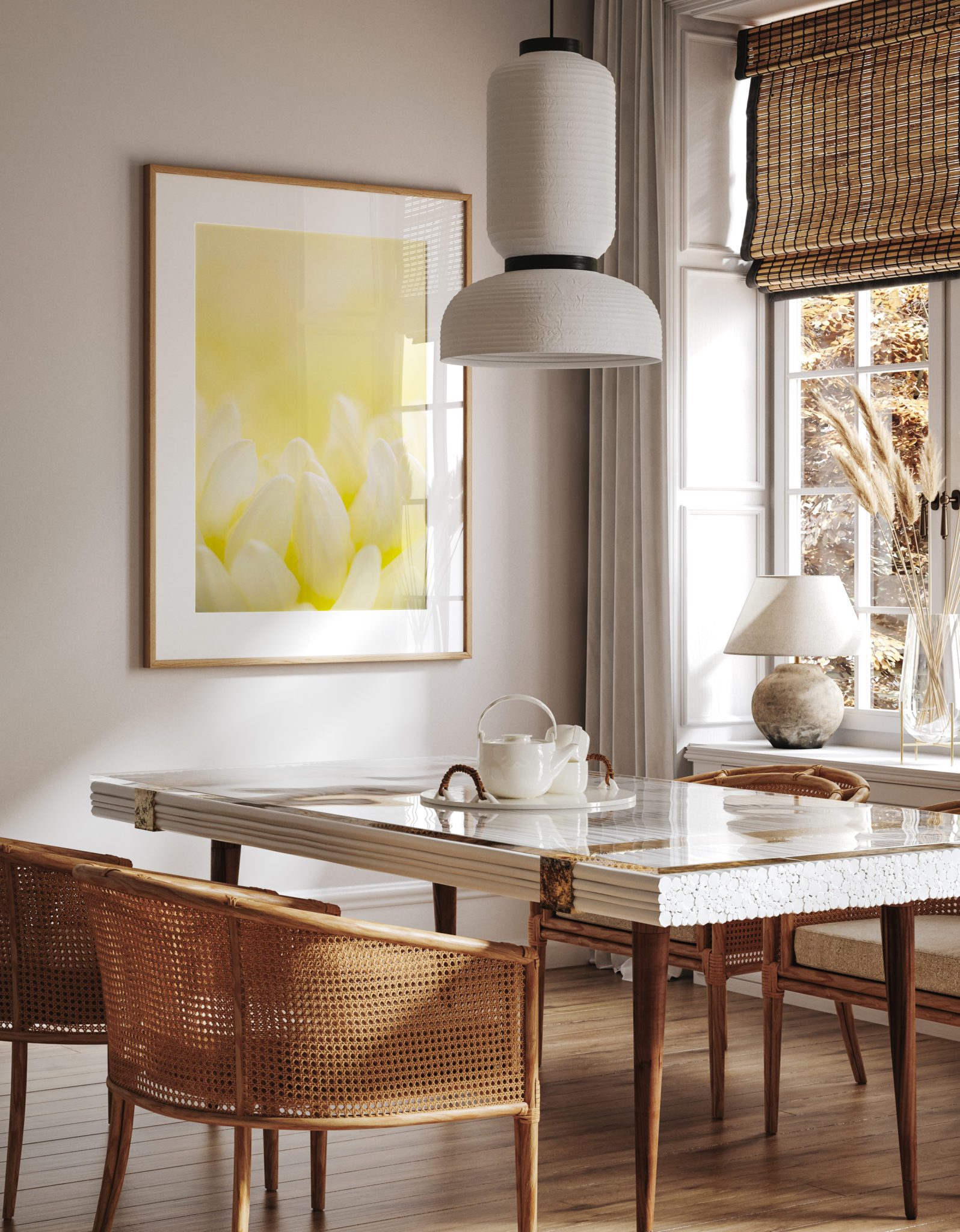
The colour I needed
Yellow is the colour I needed. Yellow offers the energy of: Happiness, confidence, playfulness, inspiration, laughter, courage, spontaneity, ideas. Yellow reaches our subconscious and pulls us up no matter where we currently are. Yellow is a warm colour though and can demand our attention, that’s for sure.
The colour yellow if too strong and bright can be almost alarming in its ability to catch your attention. Often used as a sign of danger or to serve as a warning, yellow is a colour that needs to be handled with extreme care. Yellow with a red hue can be softer, depending on the brightness but a paler, less intense yellow is more desired to surround ourselves with. The right shade with light or white tones has a much gentler approach and lets you know of its presence while gently calling you in as opposed to screaming at you.
This particular flower I had in front of me had a stronger yellow at the base which softened to an almost but not quite white as we approached the tip of the petals. This is exactly what I needed for this artwork, a yellow that is humble in its power but still assertive enough to ensure connection.
The geometry she provided
Going past the yellow colour which was amazing and spot on, nature knows best that’s for sure, was the geometry and structure of the flower. Yellow has the power to inspire and uplift, its no coincidence that this flower had petals in a gently curved shape that reaches upwards. The petals of this flower give a soft, rising energy which backs up its colour conversation.
If you can imagine petals that were more in the shape of sharp yellow spikes with hard lines that were abrupt and threatening this would have a completely different feel and would send a very different message that I would have been reluctant to translate.
The petals were many and were curved in several ways like cute little vertical canoes. Their shape holds and protects, carries and conveys. You would almost expect the petals to be placed in a horizontal orientation so the little canoes can be filled but they are standing on their tails and appear to rise.
There was an abundance of these beautiful petals, they were all similar, varying in size but even though the petals were clearly separated and displayed as individuals, they were together as a collective without any competition. Working well together as a whole to create one single flower. Clearly a family but also a team of separate entities. This aspect lends to the feeling of crowd support. You are invited to safely join them as they rise and support one another. No judgement, no competition, no hierarchy. They invite you to join their family but only if you wish to do so.
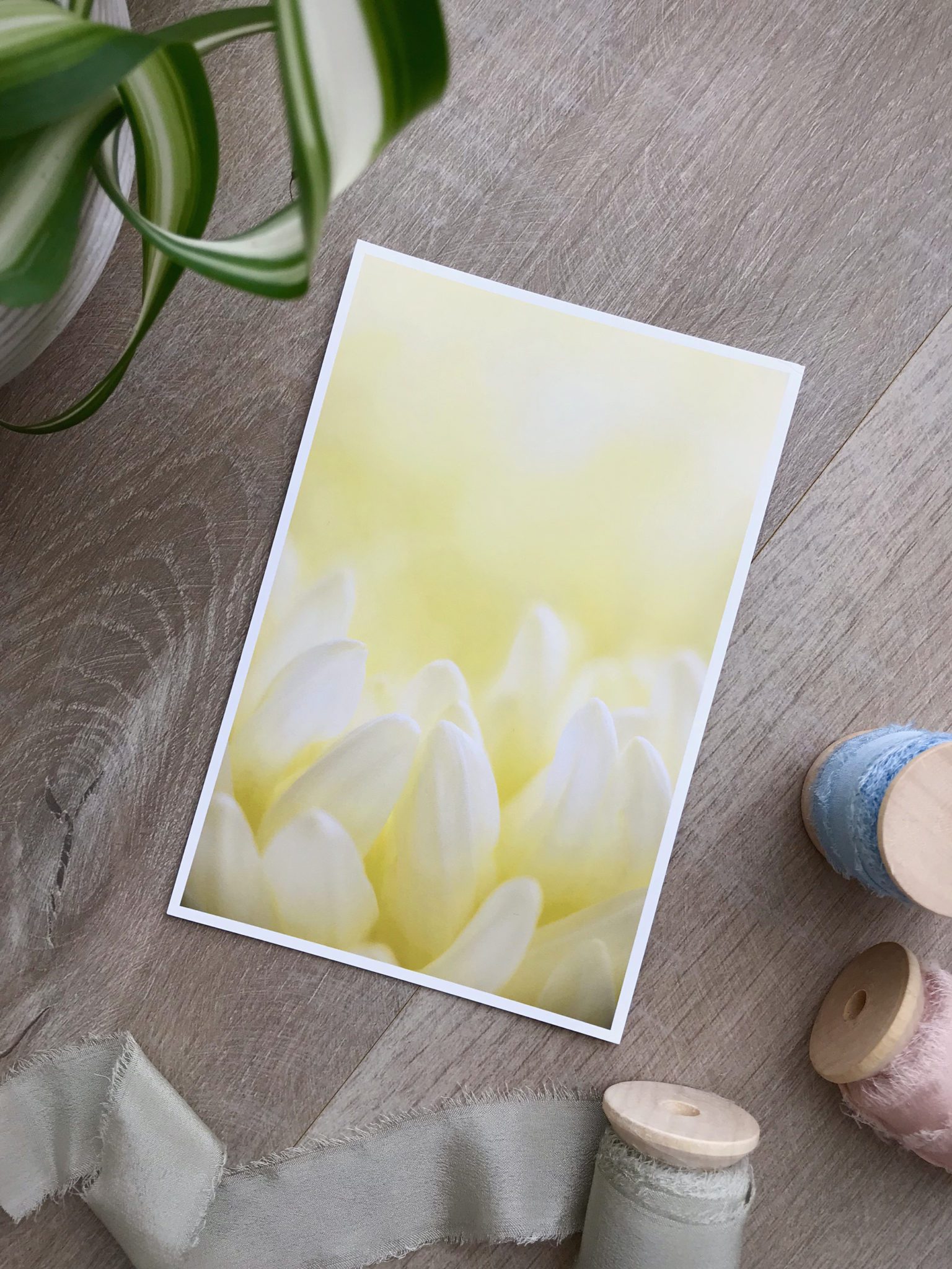
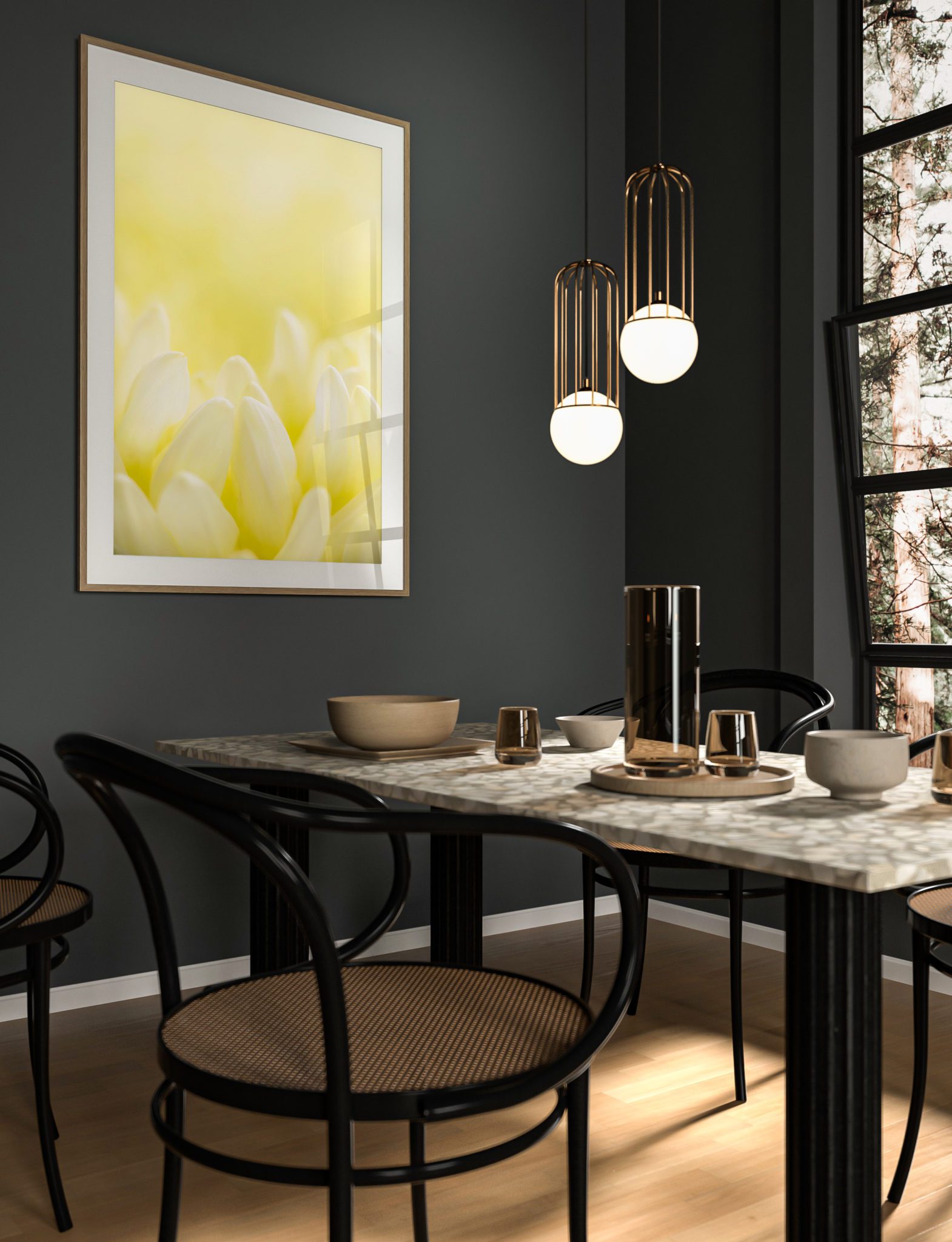
Horizontal or vertical?
This photograph had to be in a vertical or portrait orientation, no questions about that. The movement created by the rising shapes needed space above and room to grow. I placed the flower in the lower third of the frame, with clear focus front and centre. This is where your eye is likely to enter the photograph.
Our brains naturally lead our eye towards the lightest and brightest area of a photograph. It was imperative the most light was to fall on this exact location and any light falling on other elements had to be reduced. I achieve this with little black and white pieces of card used to reflect and absorb light so it lands exactly where I need it to.
Once our eye falls onto the designated petals, our brain searches to make sense of what it is seeing. If our brain can’t make sense it will move on. The focus needed to be tack sharp in this area to ensure our brains can achieve their goal and find details in the highlights. This all happens in a fraction of milliseconds. From here the geometry of the flower petals leads our eye upwards. As the focus falls back and becomes soft where the petals are towards the back, our brains tend to skip the back petals a little and keep moving on up to find a clear space where our eyes (and we) tend to float in the shades of yellow in the top half of the photograph. Try it, it’s pretty cool to see how your brain and eye walks through.
Yellow speaks to our subconscious
Your eye will drop back down trying to find something to make sense of, back down to the sharp petals in the lower third and the whole process begins again. All the while we are being immersed in a beautiful sea of yellow shades. The yellow is speaking to our subconscious, we are unaware of this until we realise this photograph is making us feel inspired and uplifted. I love the magic of colour psychology here.
It makes us feel happy, confident and playful. This is reinforced in our brain as the geometry and composition bounces us up and down within the frame. It’s a game and the prize is to feel spontaneous and courageous without even knowing exactly how or why.
While as mentioned, I am not a person usually drawn to the colour yellow, I absolutely adore this photograph. It lifts me up and puts me in a better place. It calls me to take time for myself from my day and brings to mind my inner child who needs to be reminded it is perfectly ok to relax and come out and play for a while.
Thank you so much for being here,
The Humble Hunter x
See many more examples of our nature photography or buy your copy of Wanderlust here.
